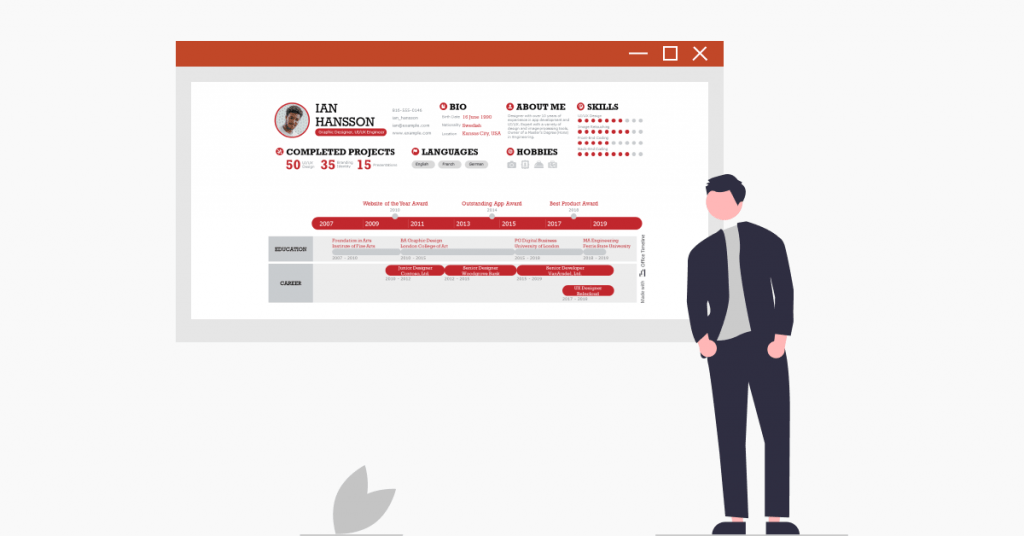
Your resume – sooner or later, you definitely need to create one. Depending on your job search goals and how you want to promote yourself, there are various options you can try out when showcasing your work experience, skills, and key achievements – from the classic text-based CV to the attention-grabbing creative resume templates or even the more professional-looking timeline resume.
In a nutshell, the timeline resume provides a quick and clear overview of your professional journey using a timeline format. Compared to the traditional resume, this format is much easier to skim through and understand by recruiters than a monotonous block of rows after rows of text that will have them strain their eyes and lose focus.
In this article, we break down the main differences between the classic resume and the timeline resume, the pros and cons of using a timeline-based CV, and how you can create one using a simple resume builder like the familiar PowerPoint software. And because we want to help you out on your job hunting process, we’ve also included two resume examples and PowerPoint timeline templates that you can quickly customize with our user-friendly timeline maker.
Classic resume vs. timeline resume: What’s the difference?
Choosing the right resume format can sometimes make the difference between being called for an interview after standing out as a potential job candidate and getting screened out in the early selection phase. Before you make your final decision, we recommend you take a look at the key differences between the classic and the timeline resume.
Classic resume
- Loved by robots but not so much by people, the classic CV format is defined by visual simplicity and features detailed candidate information grouped into individual sections.
- Since many corporations use applicant tracking software (ATS) to filter resumes before recruiters go through them, classic resumes are often considered a safer option than visual formats.
- However, when they do get read by a human, they’re far from hitting the easy-to-read mark.
Timeline resume
- This kind of resume uses simple yet powerful visuals to present your work history and qualifications in a highly readable format.
- Despite taking up more real estate on your resume than plain written text, a timeline is a great option if you want to stand out among other applicants and add a modern touch to your CV.
- Last but not least, a timeline resume can be a great fit for job applicants targeting creative positions in marketing, design, or communications.
Unsure which one is preferred by the company you’re planning to apply to? You can choose to send both versions as their formats are complementary — the one-page timeline CV will serve as a visual summary of the more text-oriented resume.
Pros and cons of a timeline resume
Since the hiring process differs across companies and industries, there might be situations when a timeline resume could win you that golden ticket to an interview and other times when it might fail to do so.
To help you understand when it’s best to use a timeline resume, we’ve put together a quick list of pros and cons.
Pros:
- Summarizes candidate information to the essential and turns it into straightforward graphics;
- Helps you create skimmable one-page resumes with the help of swimlanes;
- Showcases your visual design skills when applying for jobs in creative industries.
Cons:
- Might fail to meet standard format expectations within traditional companies and industries — the classic resume has a solid footing in these areas;
- Doesn’t leave enough room to go into details about your employment record — you can, however, expand on your career path specifics during the interview;
- Could show gaps in your resume more clearly than other formats — while old-school recruiters have an issue with unaccounted for gaps within your resume, modern-day recruiters prioritize overall experience and transferable skills.
How to create a timeline resume with a resume builder
There are two ways to go about this: the hard way, that is, manually creating graphic elements such as objects and shapes, or the easy approach, where you can use the Office Timeline add-in for PowerPoint to generate a timeline automatically.
With an accessible resume builder like PowerPoint, putting together a timeline resume is pretty straightforward.
Start by making the timeline — create a swimlane for your educational background to include periods of study and relevant degrees and another swimlane for your work history to display previous and current roles. Also, we suggest you use the timeband to highlight key milestones (e.g. awards, accomplishments) that can recommend you for the position you’re applying for.
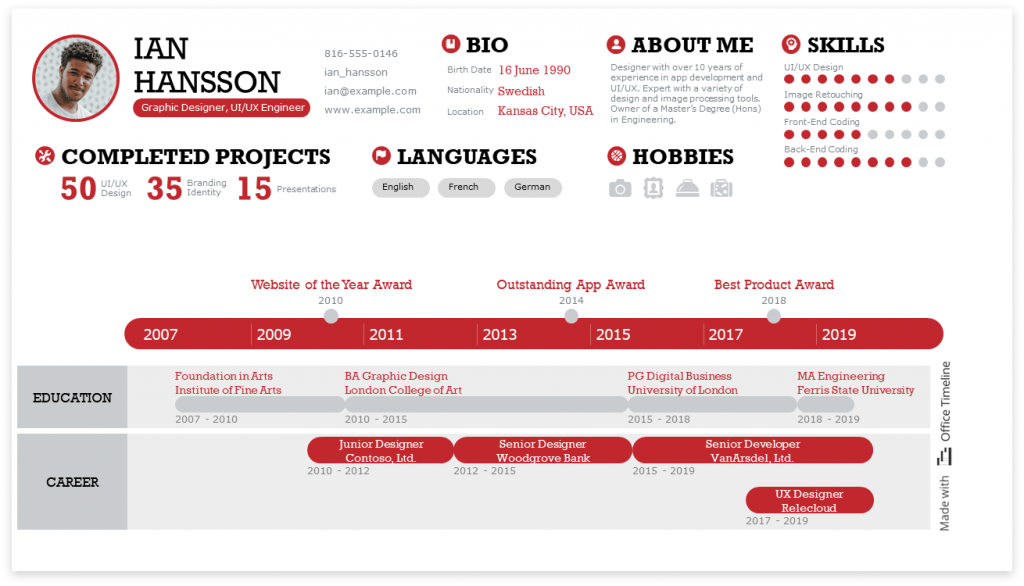
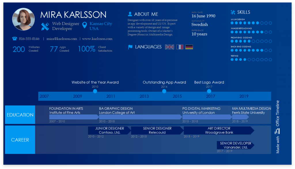
After you’re done with the timeline, the next step is to add information such as contact, skills, accomplishments, hobbies, and languages spoken around the timeline. Check out these two timeline resume examples we have prepared for you to see PowerPoint’s superpowers in action.
Timeline resume design (light background)
Timeline resume design (dark background)
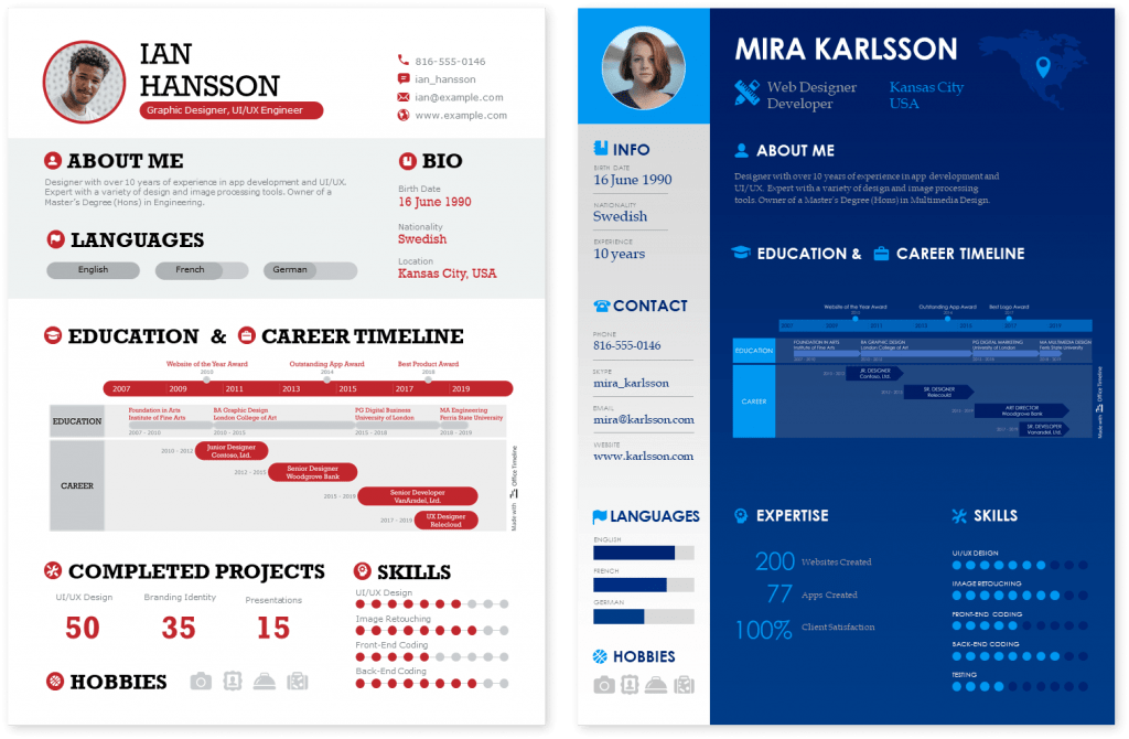
Bonus: You can easily save the timeline as an image (PNG with transparency) and import it into a regular resume to enhance readability. Here’s how our timeline resumes would look in a portrait format. You can also download these samples as a PowerPoint file and customize with your own data.
Frequently Asked Questions about timeline resumes
Here’s a shortlist of questions and answers to help you decide whether the timeline resume is something that’s worth giving a try.
A timeline resume is an innovative way of presenting your education or employment history in a visual way using a timeline format. This unique layout has the advantage of summarizing complex data into an easy-to-understand graphical representation and giving you a head start over other candidates who use the classical format.
To include a timeline in your resume, you have the option to manually build it using illustration options like shapes, charts, or SmartArt functionalities offered by Microsoft’s Word or PowerPoint. But if you want to save time and effort, you can try a professional timeline maker like the Office Timeline add-in for PowerPoint, a free feature-rich tool that helps you create stylish timelines with just a few clicks. If you use a text editor to build your CV, you can easily insert the timeline as an image.
The answer depends on desired position and industry, but most experts agree that you should try to fit your resume into one page. The one-page CV is effective because it shows off your ability to prioritize and summarize complex information, but also consideration towards your hiring manager’s busy schedule. In a nutshell, you’re making their job easier, and that can give you an upper hand.
Building a one-page CV one page is not an easy undertaking, but if you follow these five steps, you should be able to approach this task with a bit more confidence:
1. Filter your professional activities and choose only that information that matches the position you’re targeting.
2. Arrange the information in reverse chronological order, with the most recent information first.
3. Use columns to organize the information so that it maximizes the use of space.
4. Add details about skills and competencies either at the bottom or on the side.
5. For even more brevity and a visual touch, use a timeline format for your professional experience section, displaying your career and education information in two different streams. Add any important achievements as milestones on the time band.
Before sending your one-page resume out to recruiters, we recommend spending some time to customize it with fonts and colors that are easy on the eyes, so that it becomes a reflection of your professional image.
Yes, when it comes to personalizing your resume, you can draw attention to some elements by using colors. Just make sure that these are professionally safe, like blue, or dark shades of red or green. It’s best that you avoid strong vivid colors like yellow, orange or neon green for example, as these may not be a good fit for the standard work environment. Another reason why we recommend using dark, conventional colors is that you don’t have control over how your CV will be forwarded to hiring managers, and it’s possible that any styling may be lost or transformed into grayscale.
The best format for dates in a resume is the “month year” combination, e.g., “October 2020”. Usually, there is no need to include the day of the month as well. If you want to save up space you can shorten the month to its three-letter abbreviation, e.g., “Oct 2020”, or the year to its two-digits equivalent, e.g. “Oct ‘20”. You should separate the start date and the end date with a dash (“-”) or “to” and if you’re still working in a position, put “Present” or “to date” for the end date.
The information in your resume should be in reverse chronological order, meaning it starts with the most recent experience, working your way back in time. This is called “frontloading” and it ensures that the most relevant information is placed higher up on the page and in view of the hiring management. You don’t need to include every single experience, just the ones that are more important and relevant to the job description.
Visual resumes are just a more innovative way to present your profile – so yes, especially in creative industries like design, art, or education, organizing your information with graphics could make your application stand out. However, please note it’s safest to apply with a classical CV just to cover the basics and attach a visual resume as a bonus. Worst case scenario, you can use it as a talking point during the interview process.
Each type of resume serves its own purpose, so we wouldn’t say that one is better than the other. It all depends on the type of position, industry, and hiring company. The text resume is the standard and many recruiters still expect to receive it, while the visual resume is a more modern approach that can work better in certain creative environments. If in doubt, send both formats with your application and see which one gets a better response.
Employment experts concluded that recruiters look at resumes for only 6-7 seconds, so it’s crucial to organize the information so that everything is easy to understand at a glance. Since employers do more skimming than reading, it can help if you include a visual tool like a timeline format for your education and work experience, in order to condense the information into clear, distinguishable swimlanes and show the natural progression in your career.
Boost your job hunting efforts with the Office Timeline tool
Living in the digital age where there’s much more information flowing around us at all times than ever before in human history has dramatically narrowed our attention spans. That’s why capturing people’s attention by staying concise and relevant in your message and creating a visual summary of your work is as useful in project management as it is when setting off in your job hunting journey.
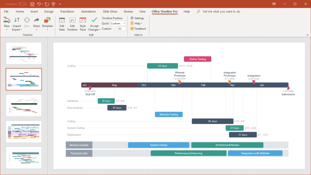
We hope this timeline resume template gives you a head start and enables you to present your professional skillset and expertise in the most visually appealing way possible. To create the timelines above, we used Office Timeline, a powerful desktop add-in that helps project management professionals effortlessly design impressive roadmaps, timelines, and Gantt charts directly in PowerPoint. Download the free 14-day trial version of Office Timeline and use the PowerPoint timeline resume template to create your own resume in no time.
Turn project data into professional timelines
Get the advanced features of Office Timeline Pro+ free for 14 days.
Get free trial